AXON — Skincare E-Commerce Website Design

Industry
E-Commerce
Headquarters
United States
Services
Website Design
E-Commerce
Visual Design
UX Research
Preview
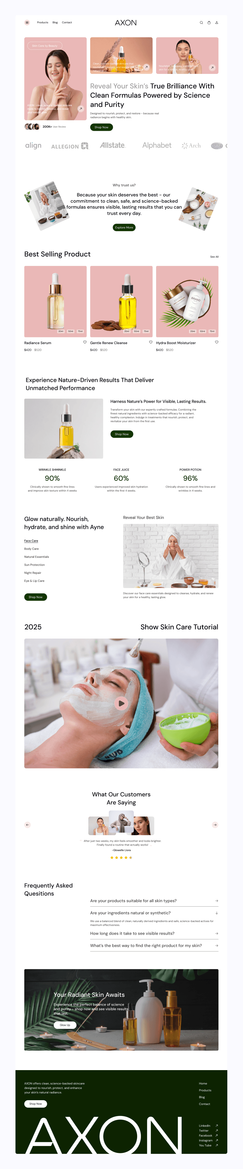
About Project
AXON is a modern skincare e-commerce brand focused on clean formulations, science-backed ingredients, and visible skin results.
The brand emphasizes trust, transparency, and a premium self-care experience.
The goal was to create a digital platform that feels calm, elegant, and credible—while making product discovery, education, and purchase effortless for users.
The website needed to balance beauty and usability, helping customers explore products confidently and take action without friction.
The Problem
Despite offering high-quality skincare products, the previous digital experience lacked clarity and emotional connection.
Users struggled to understand product benefits, navigate categories, and feel confident before purchasing.
The interface felt cluttered, CTAs were easy to miss, and the overall experience did not reflect a premium skincare brand.
Key Issues
—Product listings were difficult to scan
—Benefits and ingredients were not clearly highlighted
—Weak visual hierarchy reduced brand trust
—CTAs blended into the layout
—Mobile experience lacked consistency and polish
The Solution
We redesigned the AXON website with a strong focus on clarity, trust, and conversion.
The new experience uses clean layouts, soft color tones, and strong visual hierarchy to guide users naturally from discovery to purchase.
Every section was designed to feel calm, premium, and science-driven supporting confident skincare decisions.
What we delivered
—Clean, modern product listing layouts
—Clear product benefits and ingredient highlights
—Strong, conversion-focused call-to-actions
—Mobile-first, responsive design
—Consistent visual system for long-term scalability
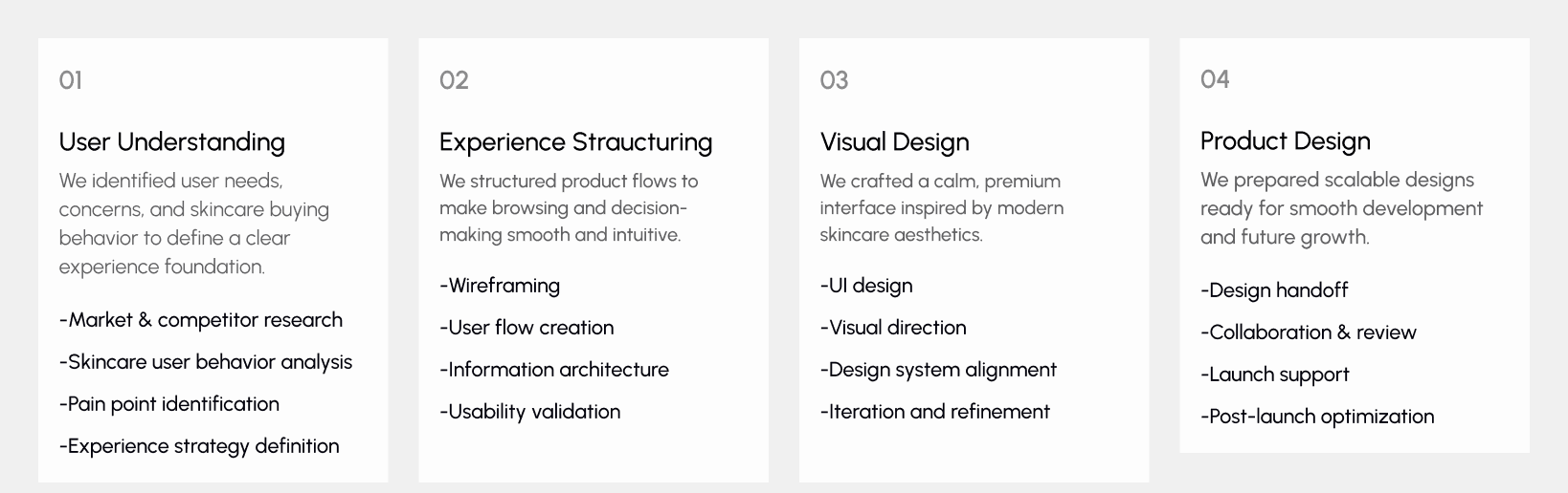
Design Process
Our design process followed a Lean UX approach, focused on simplicity, clarity, and performance ensuring each decision supports both user needs and business goals.
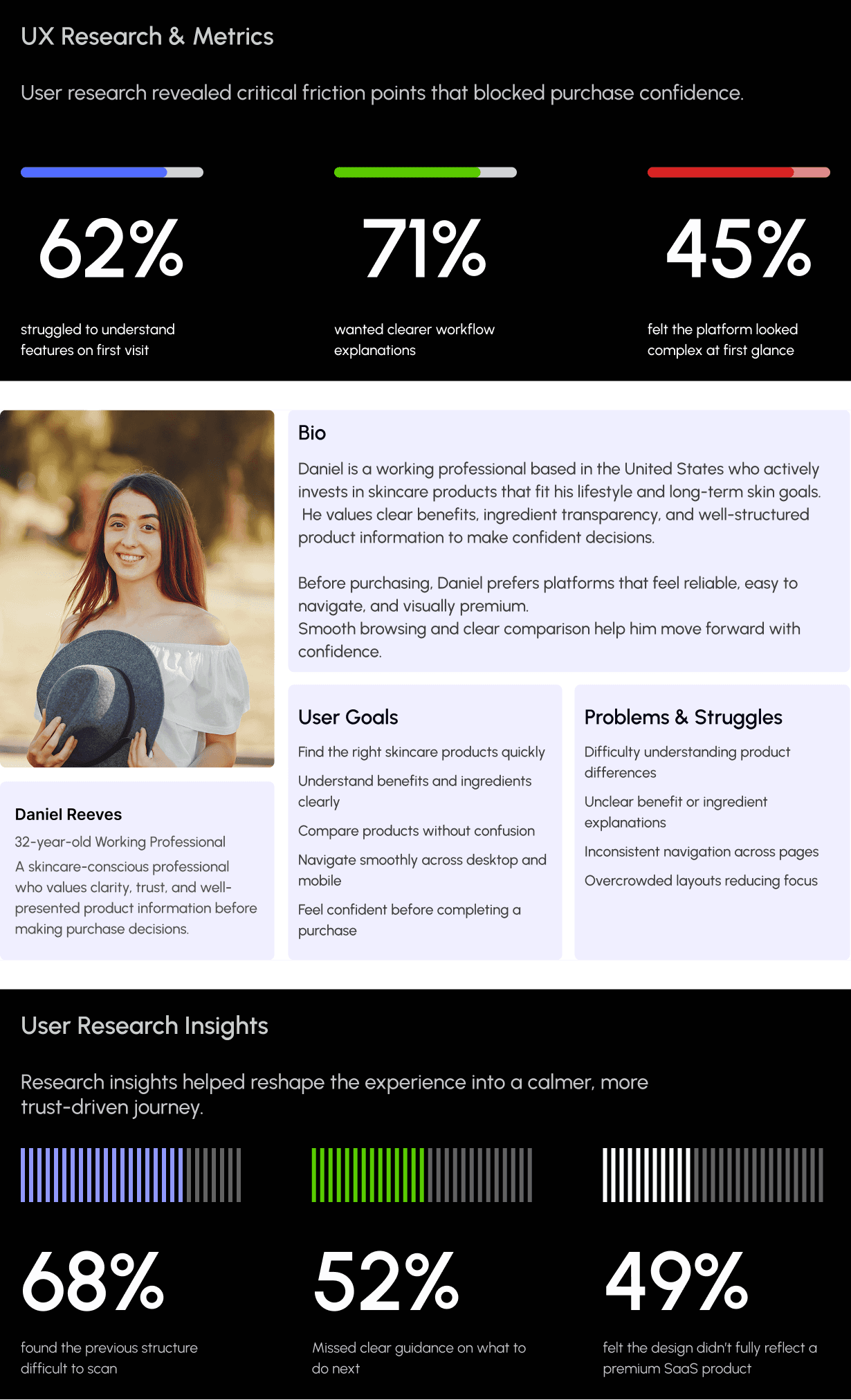
UX Research & Insights
Understanding real user behavior was a key part of the AXON project.
We conducted focused research to observe how users explore skincare products, understand benefits and ingredients, and decide when to make a purchase.
The goal was to identify key friction points and transform them into opportunities for clarity, trust, and confident buying decisions.
Our research revealed that skincare shoppers prioritize clear product benefits, transparent ingredient information, and a calm, distraction-free browsing experience early in their journey.
Based on these insights, we refined critical flows to reduce hesitation and create a smoother, more intuitive experience across all devices.
Key Research Findings
Users struggled to understand product benefits on the first visit
Many users felt unsure about which product was right for their skin
Ingredient transparency was not immediately clear
Mobile users faced scanning and readability challenges
Trust signals and clinical claims needed stronger visibility
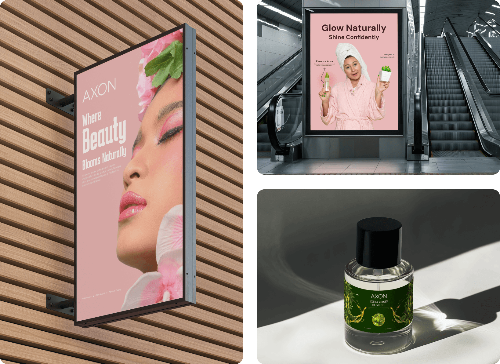
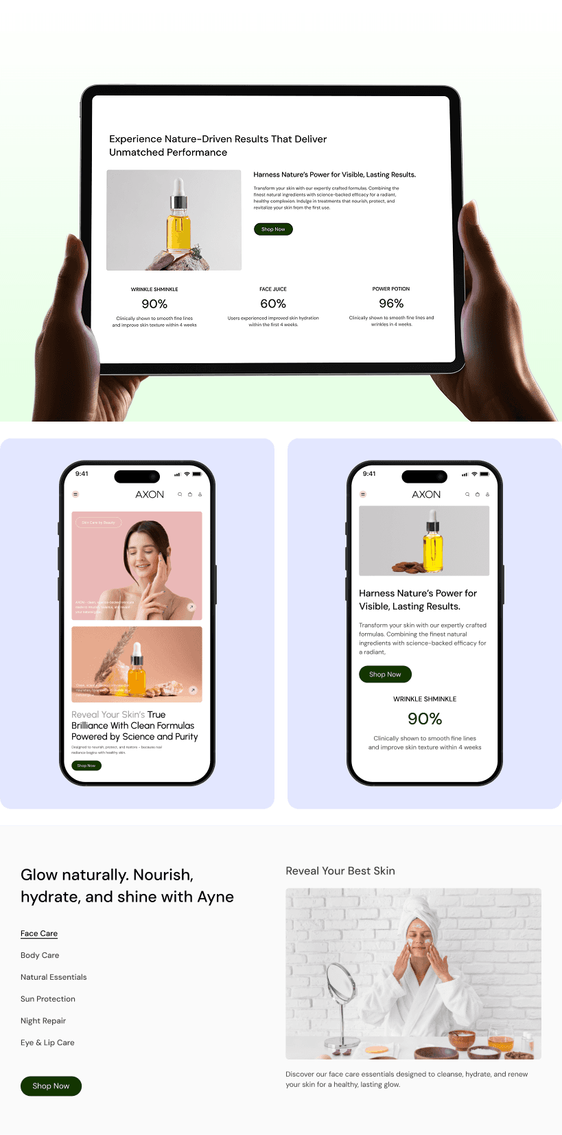
Visual Identity & Brand Story
The visual identity was designed to feel modern, calm, and trustworthy.
Clean typography, balanced spacing, and high-quality imagery reinforce AXON’s premium skincare positioning.
Each screen was crafted to feel clear, elegant, and reliable—reflecting the confidence and care the brand promises.
The result is a unified visual language that works seamlessly across both desktop and mobile experiences.
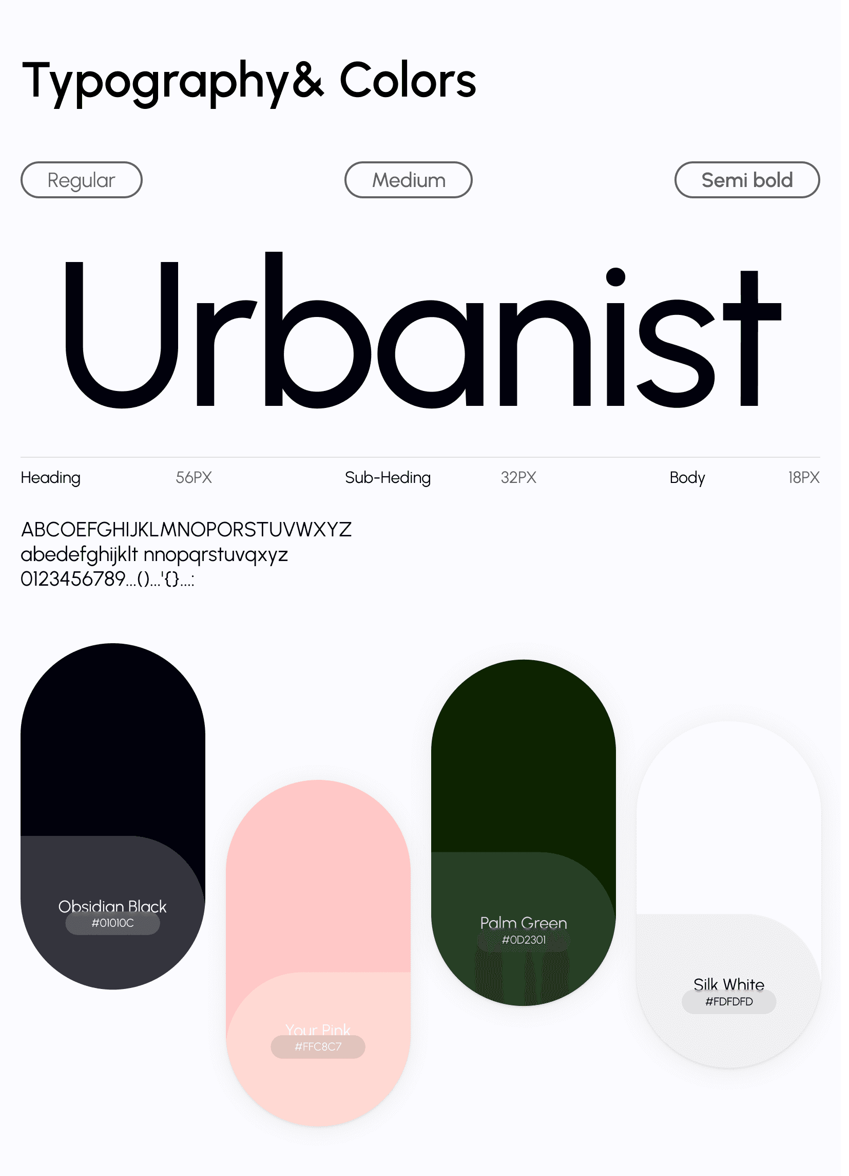
Design system
We created a scalable and consistent design system tailored for a modern skincare e-commerce brand.
A soft neutral color palette with subtle accents and clean typography establishes clarity and a premium feel.
Structured grids, spacing rules, and reusable UI components were applied across product cards, badges, FAQs, and CTAs—supporting usability, performance, and long-term growth.
UI Design
The UI design focuses on a clean, modern, and visually balanced experience that feels premium and trustworthy.
Strong hierarchy highlights product imagery, key benefits, pricing, and call-to-action buttons.
Soft neutral colors, consistent typography, and generous spacing reduce visual noise and improve readability.
The interface remains consistent across devices, ensuring a smooth and familiar experience.