Corevia — Customer Support & Automation SaaS Platform

Industry
SAAS
Headquarters
United States
Services
Website Design
Business
Visual Design
UX Research
Preview
About Project
Corevia is a modern SaaS platform designed to help teams manage customer support faster, smarter, and at scale.
The product focuses on automation, clarity, and seamless collaboration—so teams can resolve issues efficiently without complexity.
The goal was to design a professional, scalable digital experience that communicates trust, simplifies workflows, and clearly shows how Corevia helps teams deliver better support.
The platform needed to feel clean, intuitive, and conversion-focused—guiding users from first impression to confident action.
The Problem
Although Corevia offered powerful support and automation features, the previous experience did not clearly communicate value or guide users effectively.
Features felt scattered, workflows were hard to understand, and users struggled to see how the product fit into their daily operations.
As a result, engagement dropped and potential customers often left without exploring key capabilities or starting a trial.
Key Issues
—Feature presentation lacked clarity and structure
—User flows were unclear for first-time visitors
—Weak visual hierarchy reduced trust and credibility
—CTAs were not prominent or action-oriented
—The experience did not fully reflect a modern SaaS standard
The Solution
We redesigned the Corevia platform from the ground up with a strong focus on clarity, usability, and conversion.
A structured layout, clear messaging, and strong hierarchy now guide users naturally through the product story.
Every section was designed to explain value quickly, build trust, and help users understand how Corevia improves customer support workflows.
What we delivered
—Clear, conversion-focused SaaS landing page
—Structured feature presentation with strong hierarchy
—Well-defined user flows and product storytelling
—Prominent CTAs for demos and trials
—Consistent visual system aligned with SaaS branding
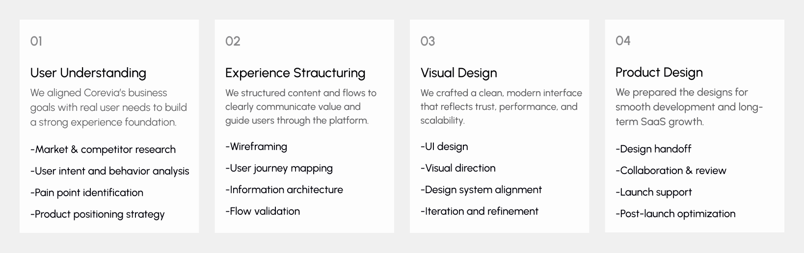
Design Process
Our design process follows a Lean UX approach focused on clarity, speed, and scalability.
The process is structured into four clear phases, ensuring every design decision aligns with real user needs and business goals.
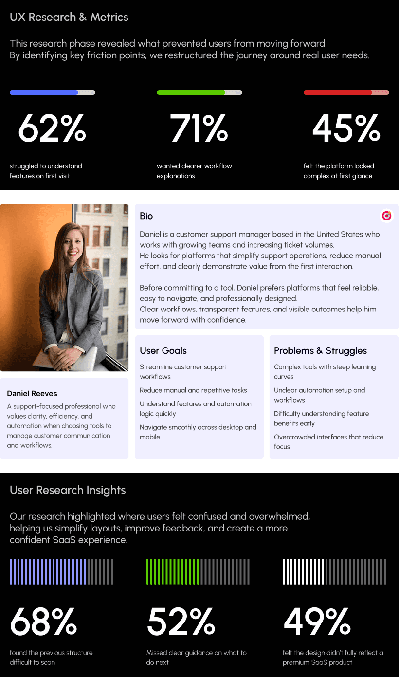
UX Research & Insights
Understanding real user behavior was a key part of the Corevia project.
We conducted focused research to observe how teams explore support tools, understand workflows, and decide when to request a demo or start a trial.
The goal was to identify friction points and transform them into opportunities for clarity, trust, and confident action.
Our research revealed that SaaS users prioritize clear feature explanations, simple workflows, and visible value early in the experience.
Based on these insights, we refined critical user flows to reduce confidence gaps and create a smoother, more intuitive journey across all devices.
Key Research Findings
Users struggled to understand Corevia’s value on the first visit
Many users felt unsure about the next step during exploration
Workflow automation benefits were not immediately clear
Mobile users faced scanning and readability challenges
Trust signals and product clarity needed stronger visibility
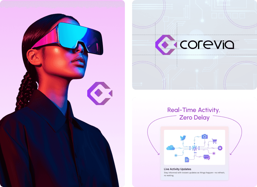
Visual Identity & Brand Story
The visual identity of Corevia was crafted to feel modern, professional, and trustworthy.
We used clean layouts, balanced spacing, and a soft, minimal color palette to reflect a reliable and scalable SaaS platform.
Every screen was designed to feel clear, structured, and intuitive—mirroring Corevia’s focus on simplicity, automation, and efficiency.
The result is a unified visual language that communicates confidence and works seamlessly across both desktop and mobile experiences.
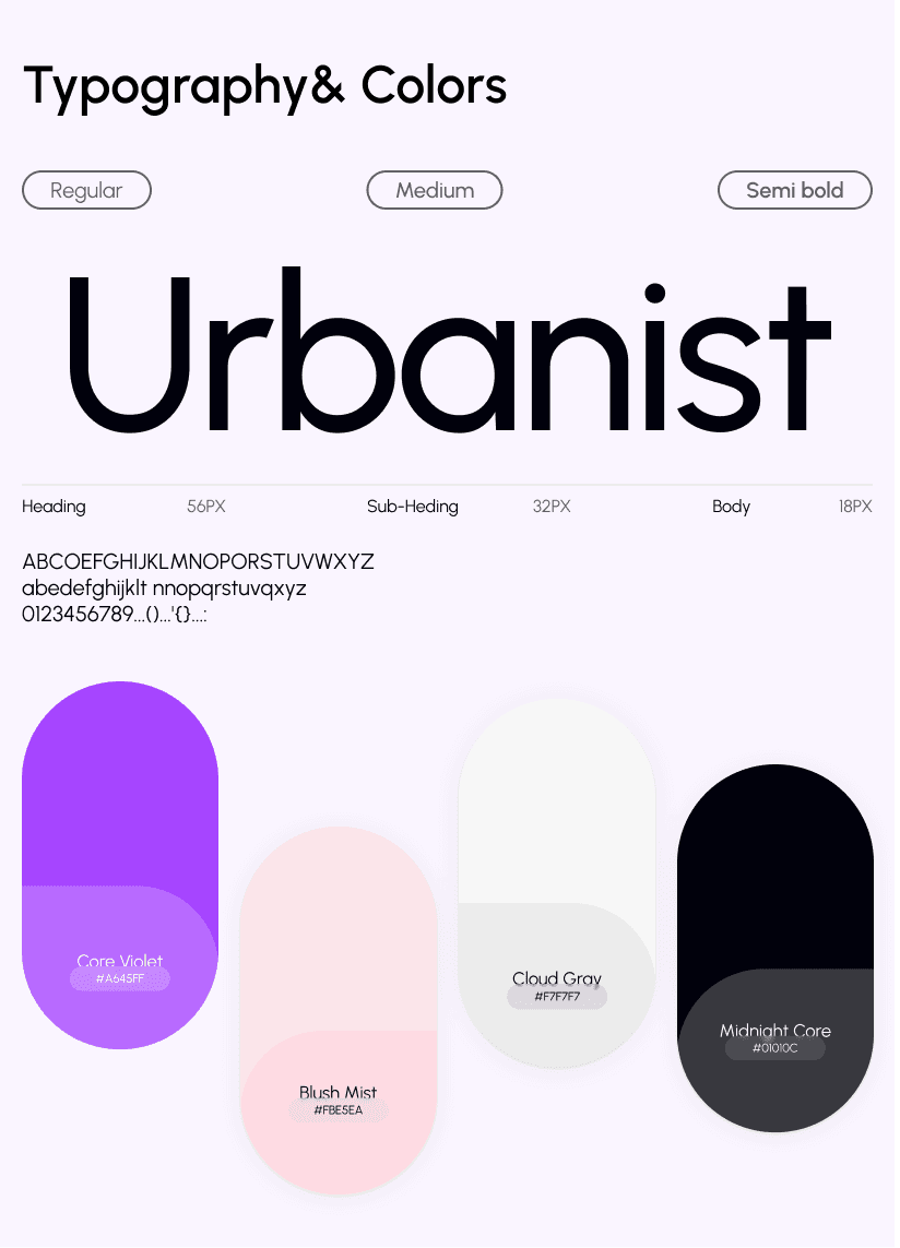
Design system
We created a scalable design system tailored for a SaaS product focused on automation and performance.
A balanced color system with subtle accents and clean typography establishes clarity, hierarchy, and a professional brand presence.
Reusable components, grid logic, and spacing rules were applied across dashboards, cards, forms, and CTAs—ensuring consistency, speed, and long-term scalability as the product grows.
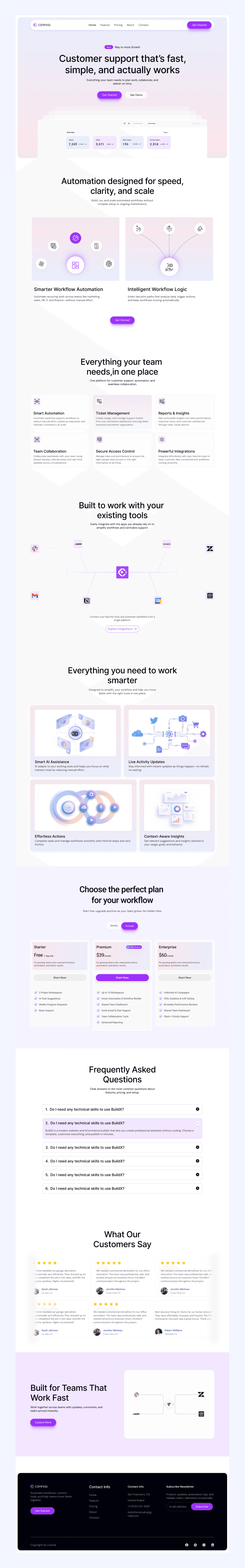
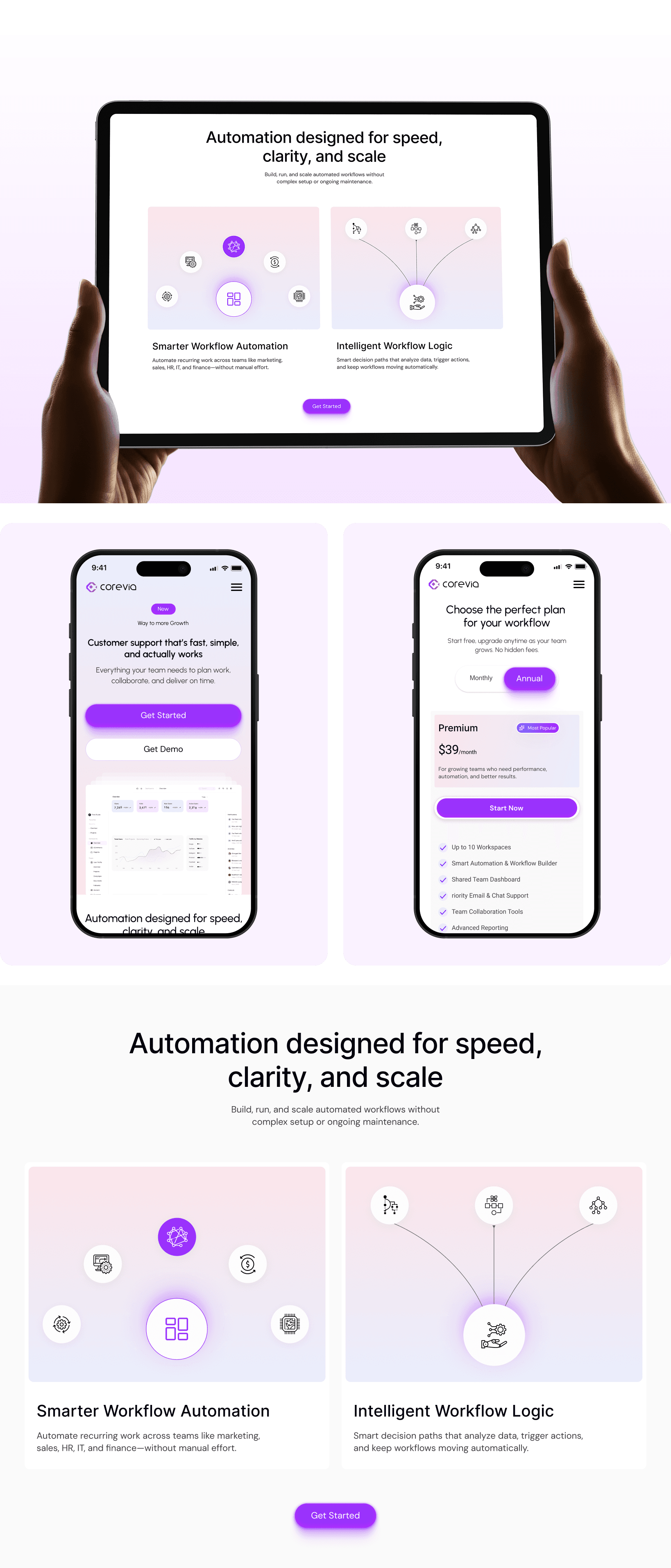
UI Design
The UI design focuses on delivering a clean, modern, and intuitive SaaS experience.
Strong visual hierarchy highlights key elements such as features, workflows, and call-to-action buttons.
A soft, neutral color palette combined with consistent typography and generous spacing reduces cognitive load and improves readability.
The interface remains consistent across desktop and mobile, ensuring a smooth experience on every device.